Our group's home is here. And a small creative world is here, too.

Archive for September, 2011

Tutorial 2 Qn 5: An Expert Review Method – Consistency Inspections

Today we will discuss Consistency Inspections, an expert review method for interface design.

What?

Consistency Inspections are aimed at evaluating consistency across a family of products (Nielsen & Mack 1994). Interfaces are evaluated by designers from multiple projects to ensure consistency within their own designs.

How?

Below are brief points to give you an idea on how Consistency Inspections are carried out:

  • For all products covered in the inspection, choose members from their respective development team to form an inspection team.
    Members chosen must have the power to vote for or against design elements
    Members must have the power to change their product’s design
  • Have a usability personnel to document interface differences between products
  • For each element documented, have the team come to agreement with what it should look and work
    All members should agree on each change
    For each change that cannot be agreed on by all members, the change will be kept for a more focused discussion in another meeting

When?

So yea, when do we use Consistency Inspections?

It is used during the early stages of development, when development work has not reached the stage where the various products require extensive changes for ensuring consistency.

Strengths

Consistency Inspections allows straightforward comparisons between products during reviews for consistency.

It also promotes consistency across groups of different products. Product managers will then be aware of issues of consistency during the later stages of development.

Weakness

There is, however, a weakness. It is difficult to make consistency judgements, and therefore makes Consistency Inspection a complex task.

My Views

Consistency Inspection is complex, for it requires many people from the various teams spanning across many products offered by a company. I hope you can see now, why it is worthy to be classified as an expert review method.

Google’s various products, Gmail, Groups, Calander are the few products that have a consistent interface.

If you were to follow this link, you will see the theme.

Being a constant user of Google services, I personally experienced Google’s change of theme across these products. I an sure that they did not have a smooth time implementing these changes, as the Google Groups interface was for sometime “under construction”. This implies that an overhaul of their interface.

However, I guess all that work was worth it, as the color scheme for the above mentioned products is clean and inviting.

References

Usability problems are any aspect of the design where a change would lead to improved system measures on one or more usability measures (Nielsen & Mack, 1994)

Consistency Inspections Retrieved from CSCL-EREM Wikisite: http://www.gsic.uva.es/wikis/cscl-erem/index.php/Consistency_Inspections

Method 13 of 100: Consistency Inspection. Retrieved from Autodesk: http://dux.typepad.com/dux/2011/05/

Our First Steps: Initial Project Concepts

Let there be light

There are multitude of camps organized each year by various CCAs and clubs in the university. Planning a camp is an arduous process that normally involves a lot of people, due to the various tasks that need to be carried out. For now, there is no tool available which helps camp organizers to coordinate the planning process. Hence, we have decided to develop a camp planner for our project.

Our camp planner will targeted at the college camp organizers to aid them in organizing students or CCA camps. The users are mainly college students, and are computer literate.

We first performed some background research to gather information about our project. We interviewed Melissa and Chriswini – both of whom have been involved in camp organizing in the past – to have more insights about the users’ experience and what they expect out of our camp planner. Their response is shown in the following table:

From our findings, there are 4 main features that should be included in the camp event planner:

The Initial Project Proposal was held on 7th Sep. Our group had 2 interfaces to present. Let’s look at them..

Design 1

The common tasks that camp organizers usually need to do are:

With these tasks in mind, we went on to design the first interface.

Welcome Page

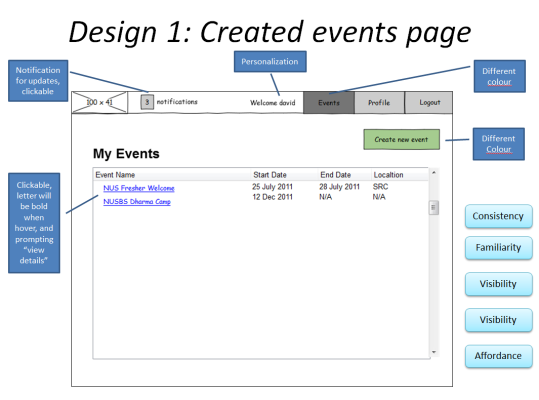
Created Events Page

created events page

Create Event Page

Individual Event Page

Other Pages under Individual Event Page

  • General information
  • Organizing members
  • Tasks
  • Participants
  • Calendar view

Design 1 Analysis

Strengths =D

  • Intuitive interface
  • Good visibility
  • Consistent across pages
  • Use of familiar user interface
  • Use of different colour button, clickable links, breadcrumbs
  • Use of constraints
  • Easy and multiple way of navigation
  • Prompt feedback provided

Weaknesses =(

  • Too many features, and thus it might involve a learning curve for new users.

Design 2

This interface is simply put, simple.

This interface uses what we call an Accordion Control. It is web control that allows multiple panes but displayed one at a time.

It opens up to look like this:

Pretty neat huh?

Wait, there’s more..

Upon clicking the Date or Time input fields, these pop up:

We call this the Date Picker and Time Picker respectively. They’re simple interfaces, but allows user to input date and times with ease.

Principles Applied

Yes, we move on to concepts. Here are the Golden Rules we applied to this interface:

Visibility

Date Picker and Time Picker provides context and enables rapid selection.

Consistency

Use of colors

The main theme color is blue, secondary color is orange.

Labeling

Naming of labels and prompts are consistent.

Affordance

Date Picker and Time Picker are designed for intuitive use.

Constraints

Date Picker and Time Picker are designed so that people do not try to do things that are inappropriate.

Navigation

The Accordion control provides support to enable users to move around the application easily.

Style

With the sky blue theme and subtle gradients, the application is aesthetically pleasing.

Design 2’s Analysis

We like this design a lot. We really do. However, conceptually, it still has its weakness, despite its strengths:

Strengths =D

Due to the above golden rules applied, the users of the application:

  • Learn the interface faster
  • Make less errors
  • Speed up use of application
  • Can better remember the application
  • Have a clear understanding of the interface

Weaknesses =(

The accordion interface:

  • does not follow the rule of familiarity, a tabbed interface would be more familiar to the average user.
  • should be used as a sub control rather than the main control for navigation.

Takeaways..

These are the comments made by Dr Bimlesh:

The Good:

  • We did a good job researching the user’s background and needs.
  •  We had enough details and features on both our interfaces.
  • Our interfaces are driven by principles =D

The Not-so-Good

  • There are too many features implemented on our interfaces.

To do:

We will scale down the number of features and focus only on the important ones. We will then work on the few important ones and come up with their prototypes. We would then let our users test them and ask for feedback. Based on the feedback, we will tweak our interfaces accordingly, ready for WEEK 9.